Shekarchian is one of Isfahan’s oldest and most well-known confectionery brands—a name whose visual identity has remained largely unchanged for many years. In this proposed rebranding project, I aimed to give the brand a fresh new face without losing the familiar character and essence that people associate with Shekarchian. The goal was to create an identity that would still feel familiar to its long-time audience while building a stronger connection with a younger generation. I wanted Shekarchian to remain unmistakably Shekarchian—but with a visual language that feels relevant today and has the potential to remain meaningful in the years ahead. ⸻ Logo For the logo, I used a Persian logotype to communicate the brand’s heritage and Iranian identity, while customizing the letterforms to create a more modern and distinctive appearance. ⸻ Visual Identity This project goes beyond the logo and color palette. As part of the proposed visual identity, I developed a range of applications and touchpoints—from the Instagram page layout, posts, and stories to physical brand elements such as takeaway drink cups. Some of these applications can be seen throughout the slides. ⸻ Photography & Graphic Language Photography and the way imagery interacts with graphic elements are also important parts of Shekarchian’s proposed visual identity. Rather than treating photography simply as a way of showcasing products, I aimed to make it part of a cohesive visual language alongside the graphic system. The approach combines appetizing, close-up product photography with simple and controlled graphic elements. This allows the content to maintain a recognizable identity while still offering enough flexibility and variety across posts and stories. ⸻ Packaging & Physical Touchpoints Another important point of interaction between the audience and the brand is its packaging and physical items, such as takeaway drink cups. For these applications, I wanted the new identity to extend beyond the digital space and establish a tangible presence in the real world as well. Every interaction with these objects should serve as a subtle reminder of Shekarchian’s character and personality. ⸻ Stories The same visual identity continues into Instagram Stories. However, since Stories tend to have a more casual and everyday nature, I suggested keeping part of the content simple, natural, and spontaneous. The intention is to avoid making every piece of content feel overly polished or heavily designed, allowing for a more authentic and approachable representation of the brand and Shekarchian’s everyday atmosphere. ⸻ Color Palette The new color palette consists of five colors inspired by the world of confectionery itself: flour, pastry cream filling, caramel, light chocolate, and dark chocolate. The caramel tone was intentionally kept close to yellow—the primary color of Shekarchian’s previous identity—to maintain a visual connection between the old and new brand identities. The remaining colors were selected to complement this direction, creating a warm, inviting, and appetizing atmosphere when used together
شکرچیان یکی از قدیمیترین و شناختهشدهترین برندهای شیرینیفروشی اصفهان است؛ نامی که هویت دیداری آن طی سالهای بسیاری تقریباً بدون تغییر باقی مانده است.
در این پروژهی پیشنهادی بازطراحی برند، هدف من این بود که چهرهای تازه به برند ببخشم، بدون آنکه شخصیت و ماهیت آشنایی را که مردم با نام شکرچیان میشناسند از بین ببرم.
هدف، ایجاد هویتی بود که همچنان برای مخاطبان قدیمی و وفادار برند آشنا به نظر برسد و در عین حال، ارتباطی قویتر با نسل جوان برقرار کند.
میخواستم شکرچیان همچنان بدون هیچ تردیدی «شکرچیان» باقی بماند؛ اما با زبانی دیداری که با امروز ارتباط داشته باشد و این ظرفیت را نیز داشته باشد که در سالهای آینده همچنان معنادار و قابلاستفاده باقی بماند.
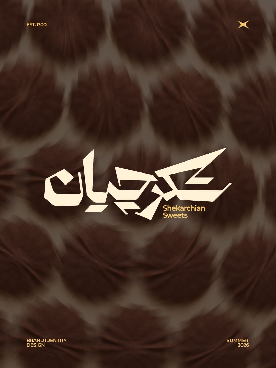
لوگو
برای طراحی لوگو، از یک لوگوتایپ فارسی استفاده کردم تا پیشینه و هویت ایرانی برند را منتقل کند؛ در عین حال، فرم حروف را شخصیسازی کردم تا ظاهری مدرنتر و متمایزتر به آن ببخشم.
هویت دیداری
این پروژه فراتر از لوگو و پالت رنگی است.
در قالب هویت دیداری پیشنهادی، مجموعهای از کاربردها و نقاط تماس برند را توسعه دادم؛ از چیدمان صفحهی اینستاگرام، پستها و استوریها گرفته تا عناصر فیزیکی برند مانند لیوانهای نوشیدنی بیرونبر.
برخی از این کاربردها در طول اسلایدها نمایش داده شدهاند.
زبان عکاسی و گرافیک
عکاسی و نحوهی تعامل تصاویر با عناصر گرافیکی نیز بخش مهمی از هویت دیداری پیشنهادی شکرچیان هستند.
بهجای آنکه عکاسی را صرفاً ابزاری برای نمایش محصولات در نظر بگیرم، تلاش کردم آن را در کنار سیستم گرافیکی، به بخشی از یک زبان دیداری منسجم تبدیل کنم.
این رویکرد، عکاسی نزدیک و اشتهابرانگیز از محصولات را با عناصر گرافیکی ساده و کنترلشده ترکیب میکند.
به این ترتیب، محتوا میتواند هویتی قابلشناسایی داشته باشد و در عین حال، انعطاف و تنوع کافی را برای استفاده در پستها و استوریهای مختلف حفظ کند.
بستهبندی و نقاط تماس فیزیکی
یکی دیگر از نقاط مهم تعامل مخاطب با برند، بستهبندی و اقلام فیزیکی آن، مانند لیوانهای نوشیدنی بیرونبر، است.
در این کاربردها، میخواستم هویت جدید از فضای دیجیتال فراتر برود و در دنیای واقعی نیز حضوری ملموس ایجاد کند.
هر تعامل با این عناصر باید به شکلی ظریف، یادآور شخصیت و ویژگیهای منحصربهفرد شکرچیان باشد.
استوریها
همین هویت دیداری در استوریهای اینستاگرام نیز ادامه پیدا میکند.
با این حال، از آنجا که استوریها ماهیتی روزمرهتر و غیررسمیتر دارند، پیشنهاد کردم بخشی از محتوا ساده، طبیعی و خودجوش باقی بماند.
هدف این است که هر محتوایی بیش از حد پرداختشده یا بهشدت طراحیشده به نظر نرسد و در نتیجه، تصویری صمیمیتر و واقعیتر از برند و فضای روزمرهی شکرچیان ارائه شود.
پالت رنگی
پالت رنگی جدید از پنج رنگ تشکیل شده که از دنیای خودِ شیرینی الهام گرفته شدهاند: آرد، کرمِ میانی شیرینی، کارامل، شکلات روشن و شکلات تلخ.
رنگ کارامل عمداً به طیف زرد نزدیک نگه داشته شده است؛ رنگی که رنگ اصلی هویت دیداری پیشین شکرچیان بود. این انتخاب به حفظ ارتباط دیداری میان هویت قدیمی و هویت جدید برند کمک میکند.
رنگهای باقیمانده نیز در راستای همین رویکرد انتخاب شدهاند تا در کنار یکدیگر فضایی گرم، دعوتکننده و اشتهابرانگیز ایجاد کنند.
